Technology has a primordial role in civic innovation, as it is helping to diagnose problems from society to the government and bringing solutions, besides improving decision-making. Among the applications, we can think of examples that include controlling waste in the city or encouraging the population to be more politically active.
Urban mobility is one of the various aspects to which authorities must pay attention. Since transportation can be a substantial source of stress, planning has a direct impact on life quality. When thinking of sustainability, this discussion becomes even more complex. Sustainable cities claim for more bike lanes and, more importantly, for the opportunity for pedestrians to complete their business in the city by walking. Pedestrian accessibility benefits individual health, besides the good environmental impact.
With that in mind, in this post, we try to measure the walkability, the capacity to reach locations on foot. The analysis uses data from Natal, Brazil, and include data science, open data, and maps. There are similar posts that were the source of great inspiration, including one from Maceió, another Brazilian city, Toronto, and New York.
All the code for the steps below is available in the repository.
Data first
The plan is to measure walking distance within a district and then compare different neighborhoods. Before getting into that, we should go deeper and get information about the people there. That’s a quick task since IBGE provides data about the income and the number of inhabitants through the SIDRA API, so the requests library will do all the work here. The per capita income and the population size are described, respectively, by the variables 842 and 841 from table number 3170.
Now, the interesting bit. How to measure pedestrian accessibility within a district? Searching for an arbitrary approach, we got to this: picking a point right in the middle of the area and calculating the distance from it to the nearest point of interest. That means finding the center, a.k.a. centroid, of a polygon. Luckily for us, the GeoJSON that describes the city has the geometry for the region of interest, consisting of a Polygon object, which has the centroid as an attribute.
The next step is to calculate the distances per se. We create a network with Pandana, which retrieves the data from OpenStreetMap in a very efficient way.
Pandana also provides a function to query the points of interest in the network. In this study, the search will be for amenities that cover basic needs: food, education, money, health, and safety. In OSM API terms, the tags are ‘hospital’, ‘restaurant’, ‘bank’,’school’, ‘police’, and ‘pharmacy’. To keep this post short, the examples here will only use schools. Please, visit the repository for the whole code.
bbox = [lat1, lon1, lat2, lon2]
net = osm.pdna_network_from_bbox(*bbox)
schools = osm.node_query(*bbox, tags='"amenity"="school"')
Following the workflow suggested in Pandana’s demo, we call set_pois to add the points to the network. That is done separately for each category. In the example below, we inform the schools’ longitudes and latitudes, besides the number of items that the query must return. Here, we also specify that we only want to know the amenities within 10km. The next step will use this information.
net.set_pois("schools", 10000, 10, schools.lon, schools.lat)
Then, the computation is done by calling nearest_pois and passing as parameters the max distance and the number of items that the function must return. The result consists of a table where each line refers to a node x and each column i represents the i-th nearest amentiy to the x, so the cell contains the distance between the two points.
net.nearest_pois(10000, "schools", num_pois=10)
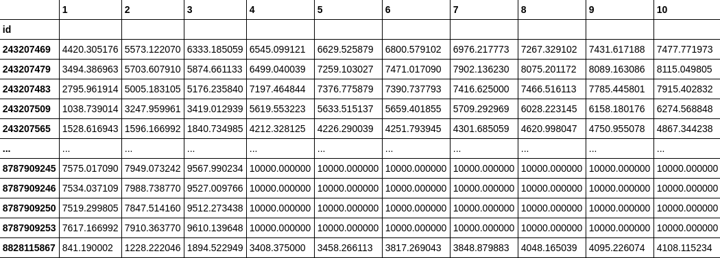
Finally, we save in the dataframe the value in column 1 and the corresponding line to that node of the neighborhood. And that’s it, our database is finished.
It’s visualization time!

The dataset is ready, so it’s time to use Folium, a library responsible for unifying data manipulation with Python, and map visualizations with JavaScript’s Leaflet. That is all a programmer needs to show their data when already having geographical data at hand.
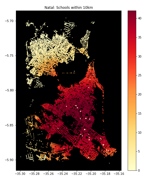
Before continuing, it’s important to mention that Pandana also provides great visualizations, including the map used as the cover image on this page. The aggregation function counted how many amenities were within 10km of each node, and the result was beautiful but hard to read. Although there is a hint of where most schools are (the middle of the city, where the nodes are redder), we can barely recognize the city, even worse to compare districts.
Now, let’s start with our interactive maps.
The maps show that, while the population is more concentrated in the north (followed by the west zone), income has an inverse tendency. The mean income increases as we go southward and even more when looking east, where the higher-income districts are.
When lloking at the walkable distance to the nearest amenity (school, pharmacy or restaurant), we can see a spatial pattern. Districts with less accessibility, meaning colored in light or dark purple, are in the north and west areas. The most notorious example is the Nossa Senhora da Apresentação district, colored with the darkest purple in all three maps. Lagoa Azul, the neighboring region, shows similar characteristics, having the darker color in two out of three maps.
Regarding hospitals and police stations, there’s a significant difference between the two sides of the river. In both maps, purple-colored districts are exclusively in the north, meaning that the inhabitants usually would have to walk at least 6km to get to the nearest hospital or police station. There are some blue-painted districts in the west and the south, where the distance is between 2km and 6km and can be problematic if we imagine having to walk this much to get to a hospital.
The analysis of distances to banks is a little different from the previous ones. Here, the western districts have darker colors, indicating greater distances, than the northern districts.
Note that in all maps, the districts in the east have a light blue coloring, usually on a smaller color scale than in the south, although the second region has a similar performance. This pattern matches the income, higher in the south and even more prominent in some eastern neighborhoods.
Final thoughts
Open data is an essential tool to empower citizens through information, providing ways to make decisions and demand actions from authorities. In the OpenStreet Map case, its only fault is regarding reliability. That’s why it’s so important to celebrate institutes such as IBGE, which not only are responsible for collecting information but also facilitate access to high-quality data.
Even though it’s not possible to draw hard conclusions because there’s a chance that some data from districts like Nossa Senhora da Apresentação, Lagoa Azul, and Guarapés is missing, the available information tells us that there’s a lack of accessibility in these areas. This affirmation corroborates with the claims from its habitants in social media and local news. The fact that most of these neighborhoods are also populous implies that many people may suffer from the scarcity of investment. So, answering the question in the title: Natal has still a long way to go when it comes to pedestrian accessbility.
Finally, future works could explore more funcionalities of Pandana. There’s interest in testing another approach to compare the walking distances. The alternative would be to calculate the distances from each node from the neighborhood to the nearest amenity, then computing the average distance for nodes in the region, and finally compare the districts.
That’s all! Feel free to reach out, ask questions, and suggest new ideas.
Links
Previous version of this study (PT-BR_)
Walkability: entenda o que é a caminhabilidade (PT-BR)
Twitter Facebook